Context
Timeline
Role
Team
Work AI for All
I took a gap quarter during my final year of college to explore what design might look like for this new AI-assisted era of work. I reached out to and joined Glean, a startup that connects to all your company's data and uses AI to understand everything about your work and what you do.
This opportunity was particularly exciting given the rapid pace of AI development, and how it's unlocking opportunities we couldn't have imagined only a few years (or months) ago. I also wanted to experience working at a company with only a handful of designers. Previously, I had either been the sole designer at early-stage startups or a part of the 70-person design teams at Figma and Slack. Glean was in-between where I was their seventh designer and they had just raised their Series E funding.
Problem
The AI chat composer is cluttered and can't scale with Glean's growing feature set.
As Glean added more capabilities, the composer became crowded with controls, some rarely used and others hidden entirely behind shortcuts. New users struggled to know where to start, while power users couldn't efficiently access advanced tools. Without a framework for introducing and organizing new features, every release risked adding more friction and slowing adoption.
Solution
A redesigned composer that speeds time-to-value and drives deeper product usage.
We reimagined the composer to focus on the most important actions first, making core workflows faster for everyone. Advanced features are still accessible but surfaced more intentionally so they are discoverable without overwhelming the interface. The new structure is built to accommodate future features without clutter, creating a scalable, approachable, and more engaging experience for every type of user.
Product
Glean Chat: Assistant
I worked on the Assistant Core Team alongside Dorothy Kang, who had joined a few years prior as the second designer. Glean Assistant let users chat with their company's data. For example, you can ask "Who is Austin Lee and what is he working on this week?" or "Give me the latest on the composer redesign project."
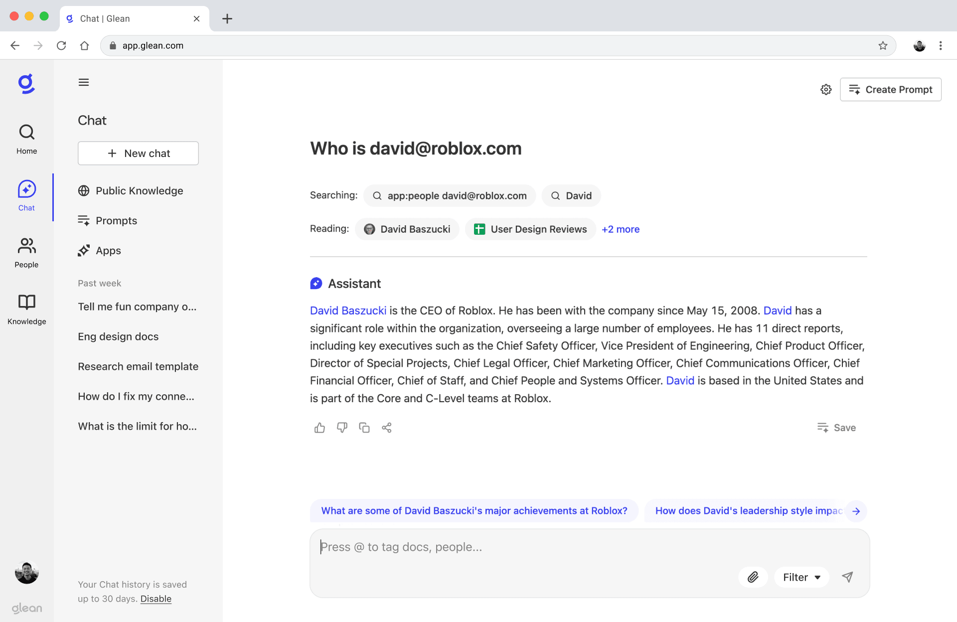
glean assistant chat with composer
However, there's a separate feature called Public Knowledge, which uses the same Assistant interface, but doesn't incorporate any company context (I know... it's confusing, right?). Public Knowledge is simply just another way for users to chat with a large language model (LLM). For example, you can ask "Help me debug this Python code" or "Here's an email draft, help me fix grammar."

Glean Assistant and public knowledge
Problem
Composer for Glean Assistant
One of the main projects I worked on was redesigning how users interact with Assistant through the chat composer. There were a couple reasons why this was important.
1. As Glean continues to grow and launch new products, everyone wants their feature to be the most discoverable from the composer. This just doesn't scale. With new projects being built, and more on the roadmap, the composer interface would soon become cluttered. For example, our data source filtering tool, while powerful, is taking up prime real estate despite only being used by a fraction of power users.
2. Many powerful tools, like document tagging are hidden because they rely on keyboard shortcuts. Even our own employees weren't discovering these features. We needed a way to make advanced functionality more discoverable while keeping the interface clean and approachable. This meant rethinking how we surface controls, handle Public Knowledge, and guide users to get the most out of Assistant.
Current composer in glean assistant
Opportunity
How might we simplify the composer interface while ensuring that advanced features remain accessible and intuitive for users?
Competitive Analysis
Messaging Other Composers
I began by exploring chat messaging products (like Discord, iMessage, and Slack) along with other conversational AI apps (like ChatGPT, Copilot, and Cursor). I looked at how each product designed their composers and integrated tools into the interface. It was interesting to note the differences, like how Slack has a tons of tools while ChatGPT is much more minimal.
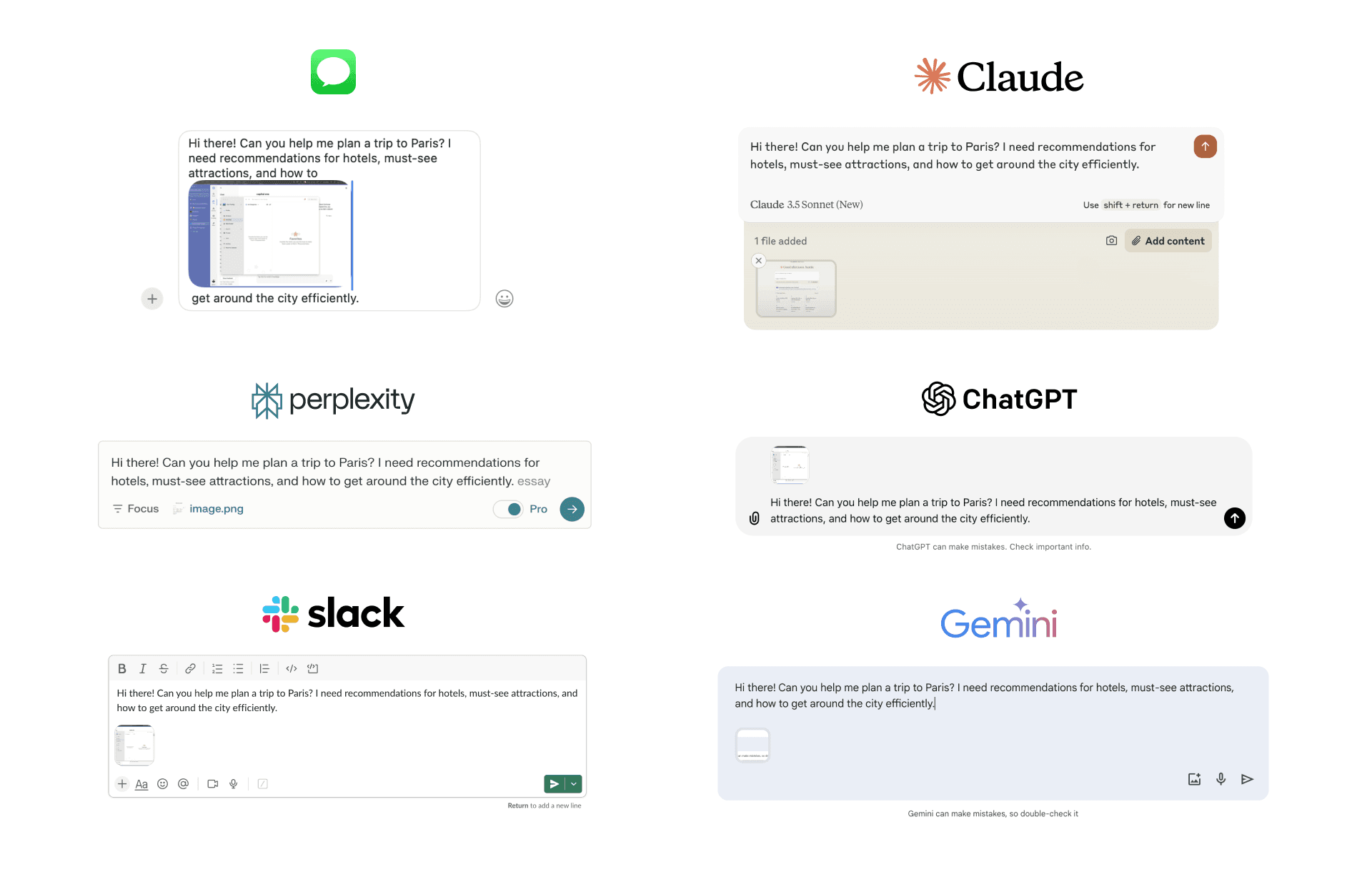
various chat composers from different products
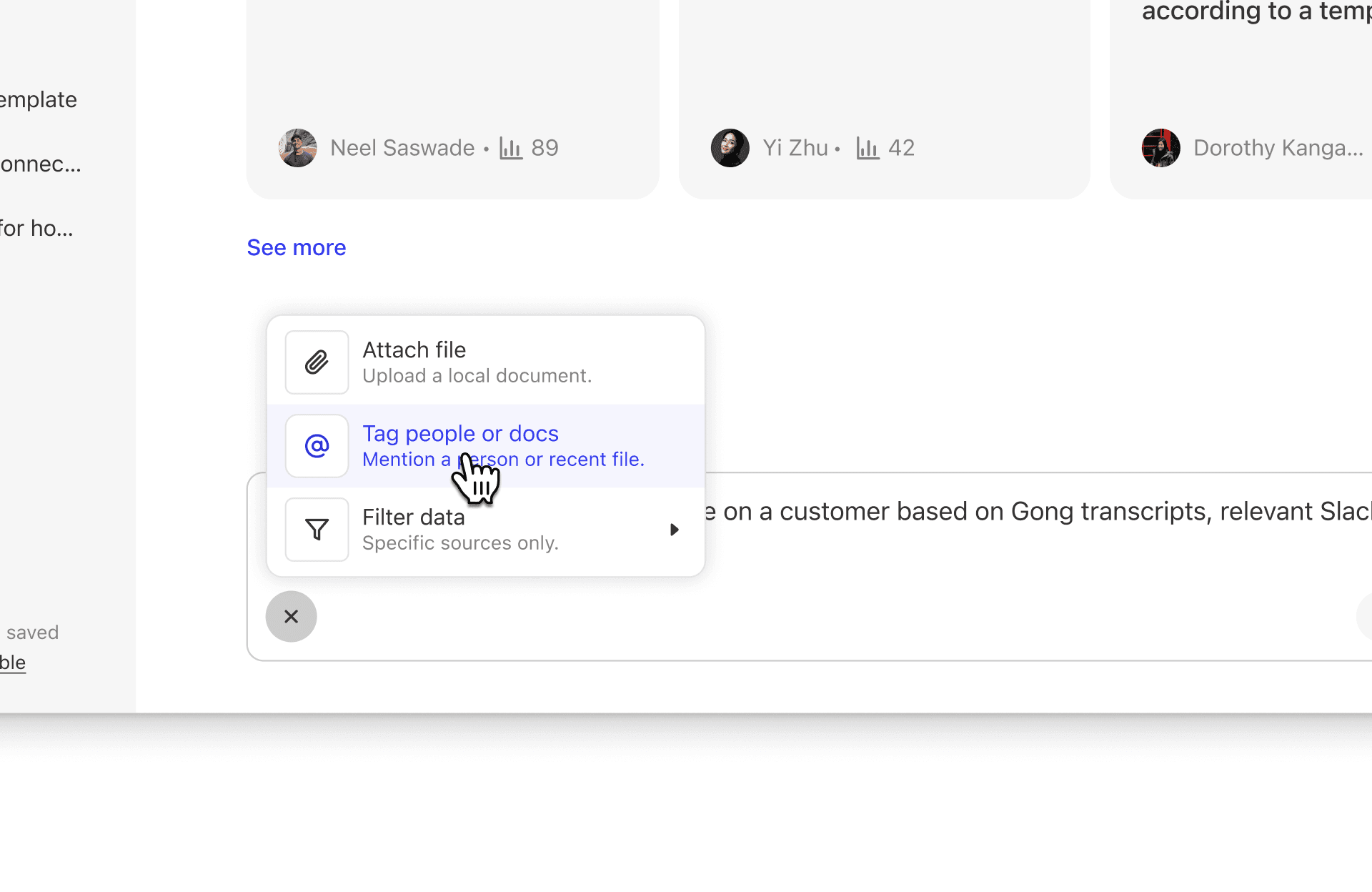
There was also a pattern across all of these chat products, especially AI apps, where a button is used to open a menu of tools. This concept was something I had also been exploring. If we can move all the tools a layer behind, like a folder, this would declutter the composer, while making it scalable for the future. I explored how we could use a button to open up a menu of tools. This button would have an [+] icon and animates into a [x] close icon as the menu opens.
![Explorations and concept of a [+] menu](/_next/image?url=%2Fimages%2Fglean%2Fplus-menu-explorations.jpg&w=3840&q=75)
Explorations and Concept of a [+] menu
What to Explore Next
So many potential paths, which one to go down??
To better understand the composer, I mapped out its core functionality into two main paths. First, there are knowledge sources, like getting data from a connected source (Gmail, Slack, Jira, etc.) or just the LLM (Public Knowledge). Second, there are executable objects, like running a Prompt or using Glean actions (search, read, think, etc.) that are used to perform specific tasks.
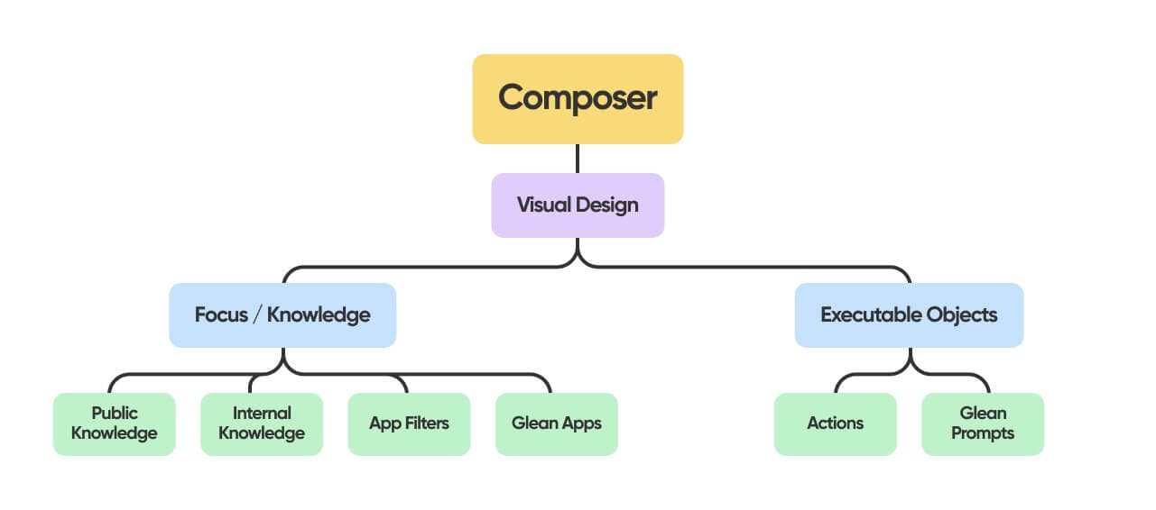
Visual tree of what the composer
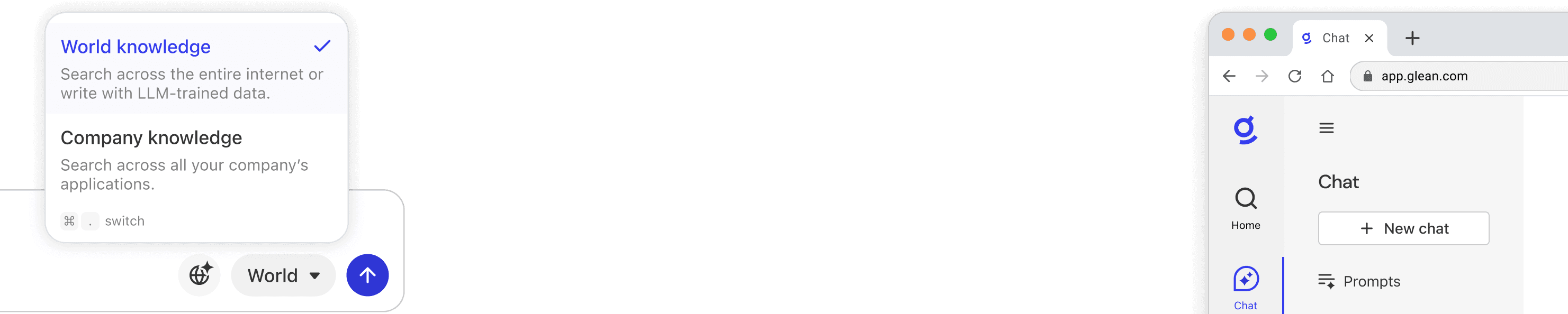
There were so many paths to explore. However, I thought the area with the highest potential for user experience and business impact would be around Public and Company Knowledge. Currently, this concept of Public Knowledge is challenging to explain, and its location on the left sidebar makes it even more difficult to find.
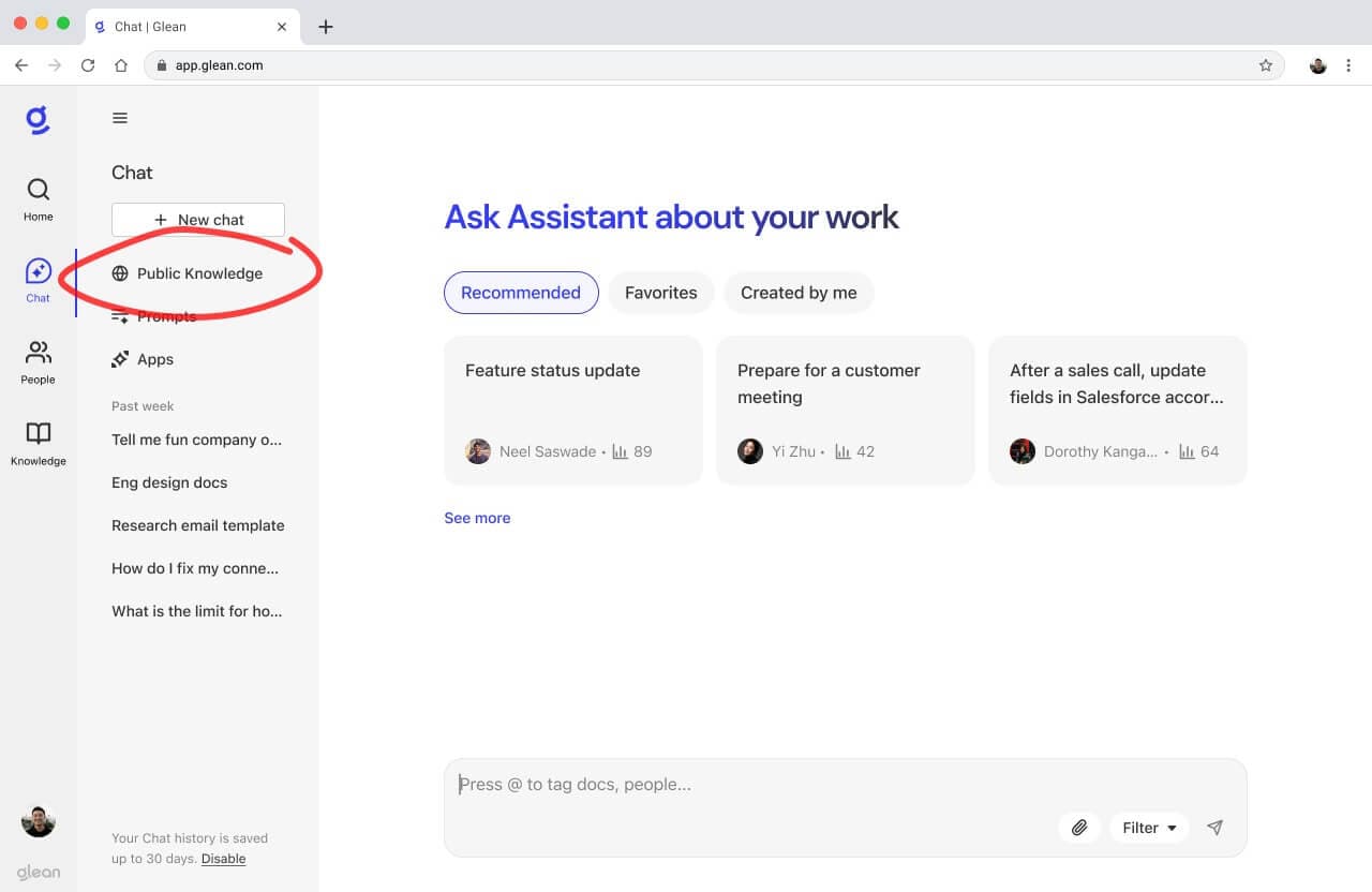
Public knowledge entry point in glean
Iteration #1
Bringing Public Knowledge into Assistant
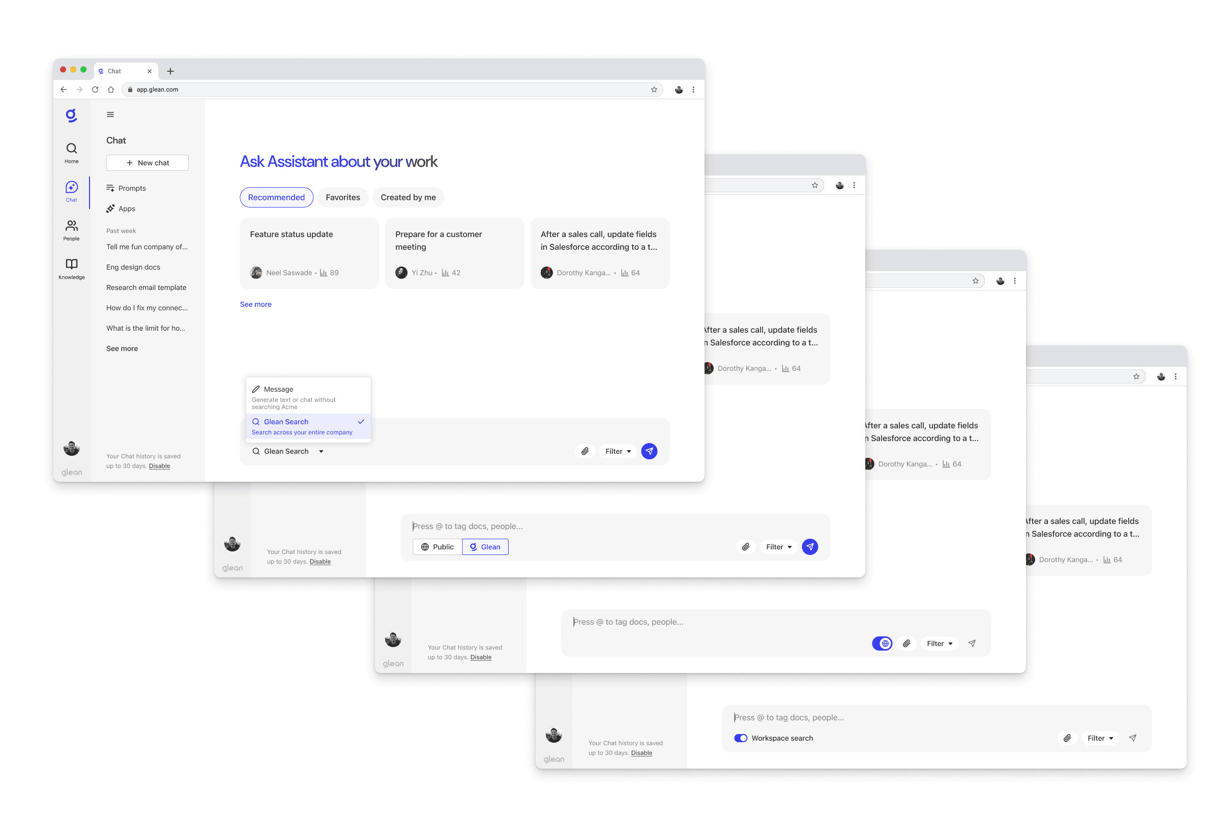
I talked with our product manager, Thai Tran, and turns out almost 1 out of 4 user queries have no search intent. This means that users might be asking to edit text, write code, or explain errors. While Assistant tries to guess user intent from the message, this approach wasn't always reliable. So we wanted to introduce a way to guarantee that a query wouldn't include company data and dilute the quality of Assistant's response. Thai and I thought we could introduce a new 'writing mode', which would ensure no searches were performed and it'd just be the LLM (Public Knowledge).

writing and company search modes
I thought about how we should explain this to users. Currently, these exist as two separate products in Glean, which is confusing since they look so similar visually but have such different functionality. So I explored what bringing Public Knowledge into Assistant might look like. If we do that, we could still maintain a separation by using tabs or a dropdown to give both options equal prominence. Alternatively, we could maintain company knowledge as the default, and allow users to disable it when they don't need company documents in the response.
design explorations of writing and company search modes
Iteration #2
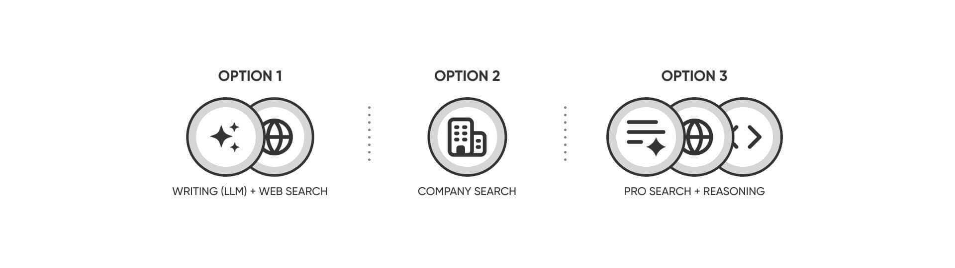
Wait - Now There's Going To Be a Pro Search Too?
But right as I started working on this, I learned that our engineering team was exploring a new Pro Agentic Search experience. Unlike regular search, it would use AI to generate a series of actions to execute the user query. This feature would be very powerful, and would intelligently combine Writing, Company Search, and many other tools.
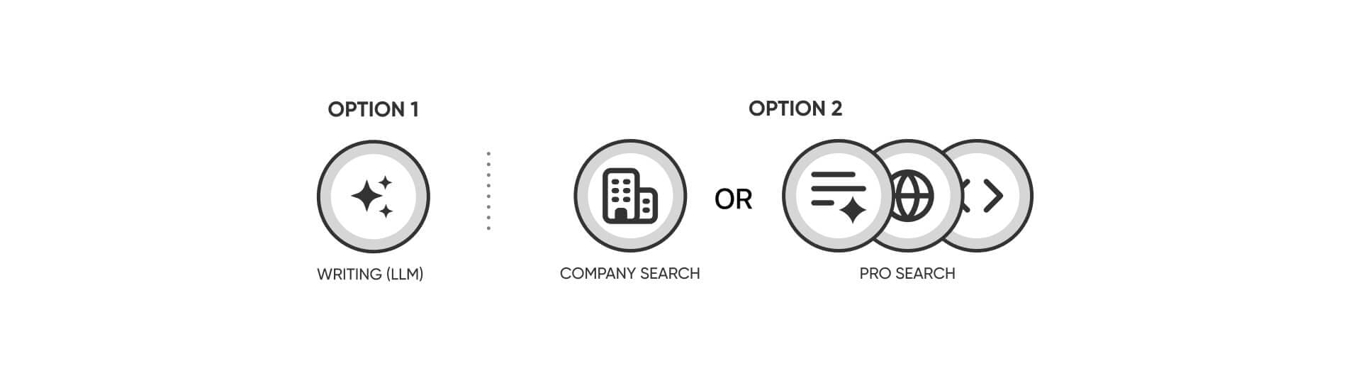
writing, company search, and pro search modes
This added another layer of complexity. Users would now have two main choices: Writing mode or Company Search. If they chose Company Search, they would then need to decide between using the regular search or the more advanced Pro Search functionality. Here are some explorations of what that might look like if we used a dropdown.
design explorations of writing, company search, and pro search modes
Iteration #3
We're Also Launching Web Search Soon??
The project became even more complicated as another variable was introduced: web search.
I talked with Thai again, and we decided to treat Pro Search as a separate option since Pro Search technically could decide to use web search, company knowledge, or just the LLM. Pro Search was also still exploratory and further down the roadmap, so web search took priority since it was actively being built.
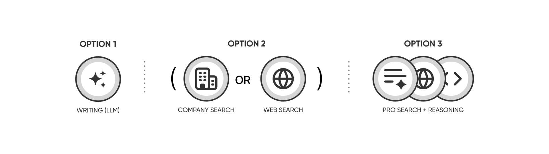
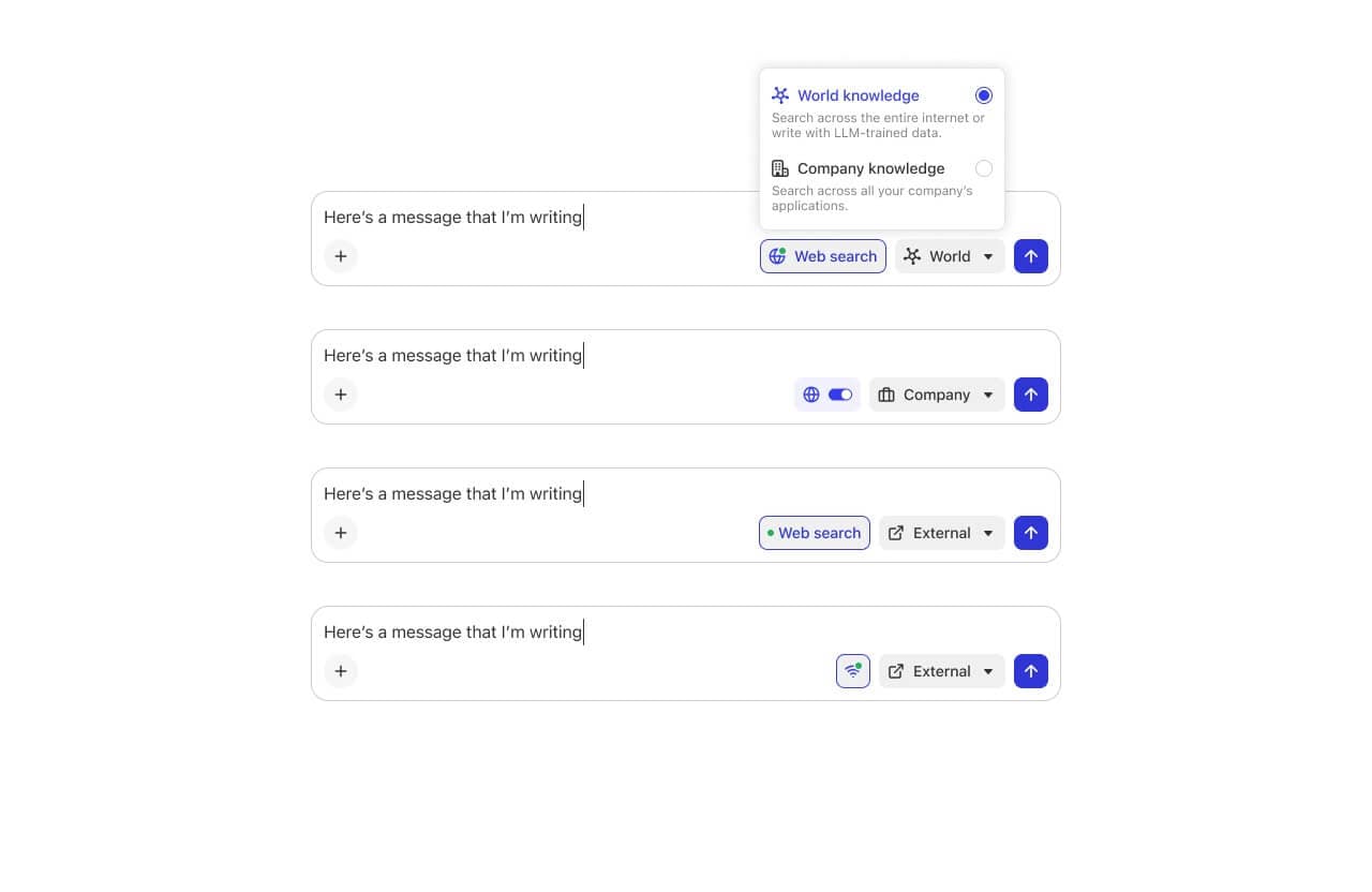
writing, company search, web search, and pro search modes
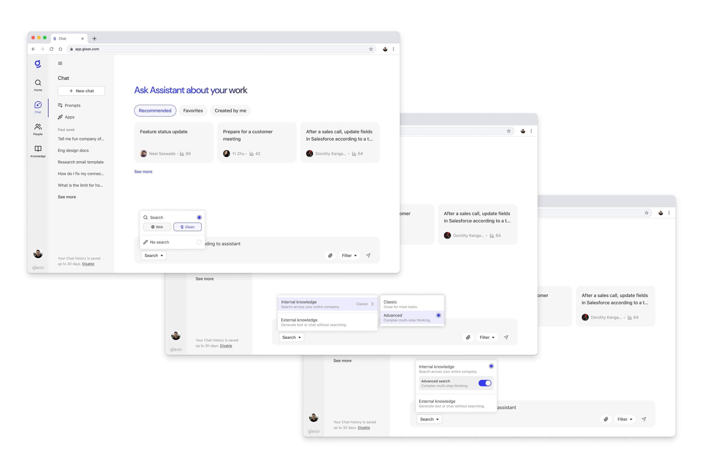
Now knowing we needed multiple modes (writing, company, pro search), I began exploring ways for users to select and switch between the different options.
I brought some concepts to design crit and the dropdown emerged as the most viable option since it allowed us to have clear distinction between the options. The subtext in the dropdown options also helps further clarify the different modes. The other designs felt detached from the composer, too difficult to use, or added unnecessary visual complexity to the interface.
design explorations of writing, company search, web search, and pro search modes
Iteration #4
Many different potential permutations, how should we frame and launch this?
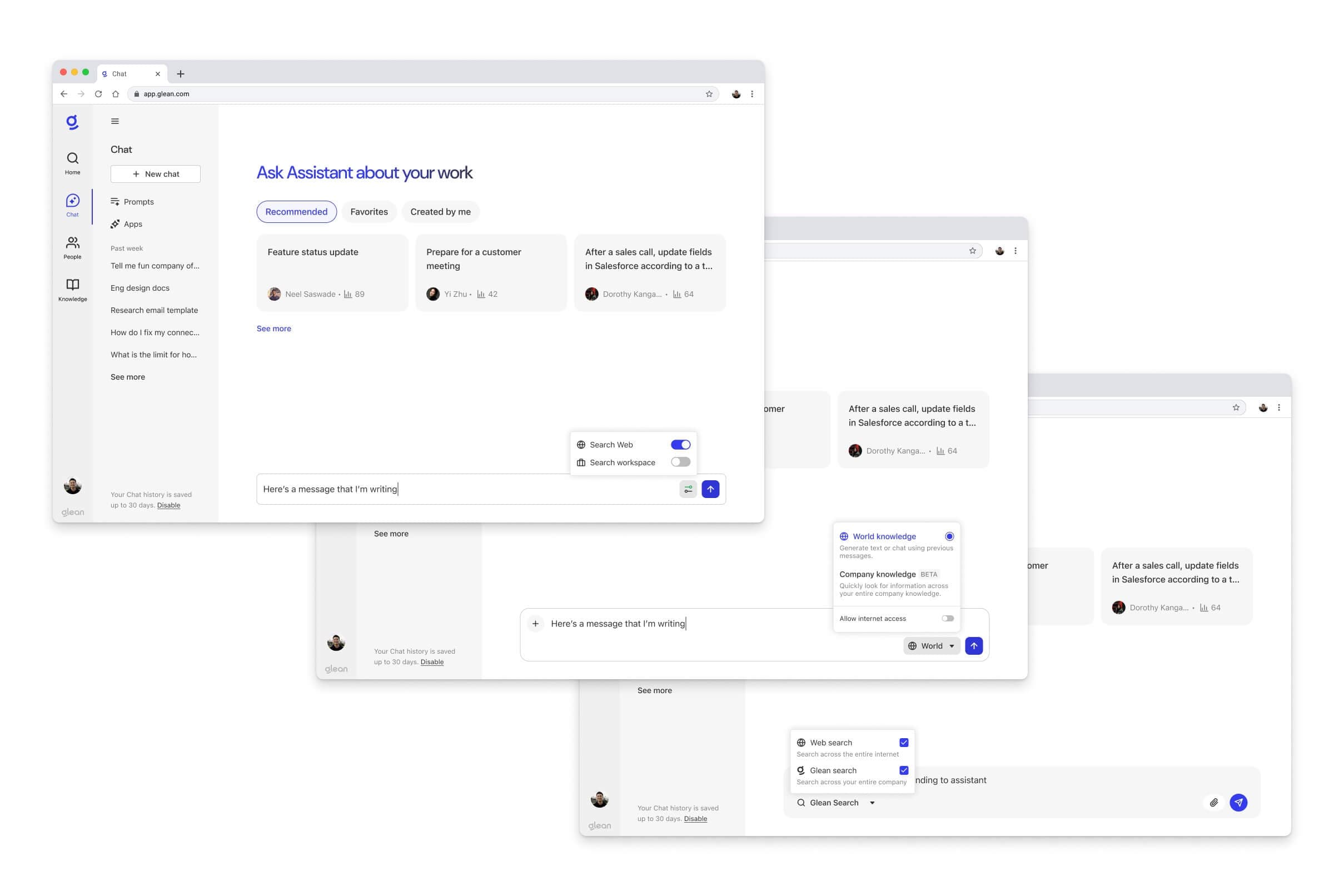
As we got closer to a visual design direction that worked, we needed to figure out how to communicate all this complexity. We also had to keep in mind that for many users, Glean is the only AI tool that they use. So I talked with Dorothy and Thai and got more concrete requirements from the web search team. We decided to only offer web search in the writing mode, with web search being optional.
writing, company search, and pro search modes
This led to some design explorations around these three modes. I ultimately decided to continue using the dropdown pattern from crit. There were two initial directions. First was to have the web search toggle inside of the dropdown menu, underneath the writing option. The second option was to show the toggle outside of the menu when a user switches into writing mode.
web search toggle inside and outside the dropdown
Both ideas seemed great on static Figma mocks... until I started prototyping them out to see how they'd feel. Right away I discovered an issue with placing the toggle inside the dropdown menu. Since the menu collapses after each selection, users would need to reopen the dropdown every time they wanted to adjust the web search functionality after switching to writing mode. This approach just didn't feel right, which led me to move forward with the second option.
Framing the Feature
What do we call this??
Throughout this project, the trickiest part was figuring out how to frame this feature. The design is important, but the copy and naming are equally crucial. I worked with Marissa Huff, our product marketer, and brainstormed a ton of different names and descriptions that we could use.
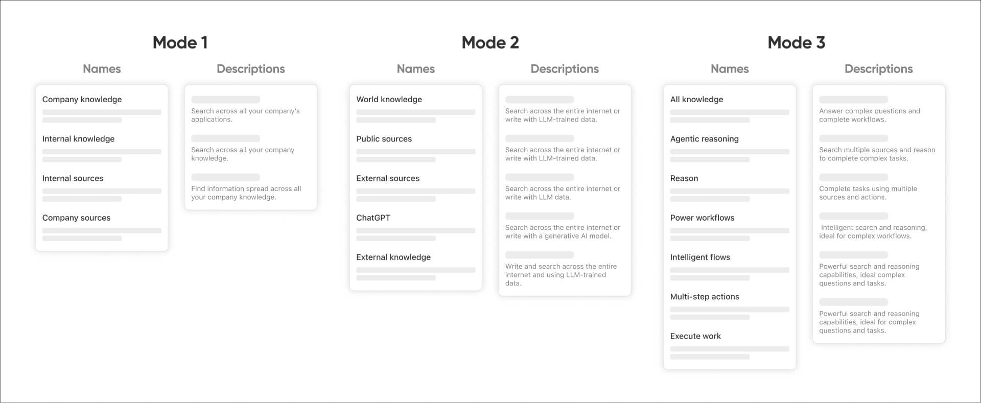
list of names and descriptions we considered
User Research
What do users think?
Now that we had a few naming options and a polished design prototype, Dorothy and I conducted user research sessions with five Glean employees. We focused on testing the usability of the new chat composer's dropdown modes, [+] menu button, and how well participants could understand these features. We interviewed a wide range of employees from beginners to AI power users. Our participants included an engineer, an executive assistant, and a customer success manager. We also included two new hires who had just joined that week to get completely fresh perspectives.
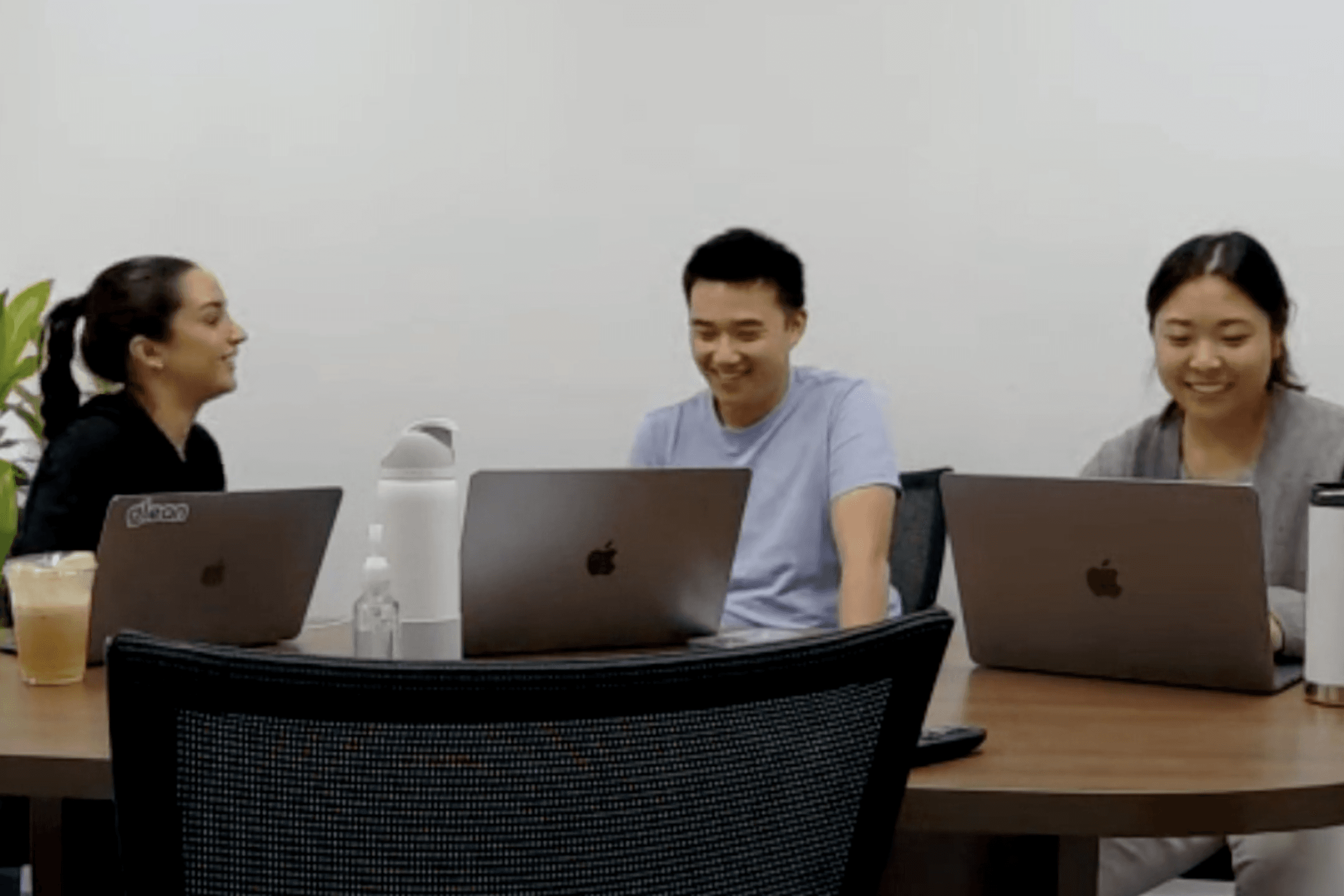
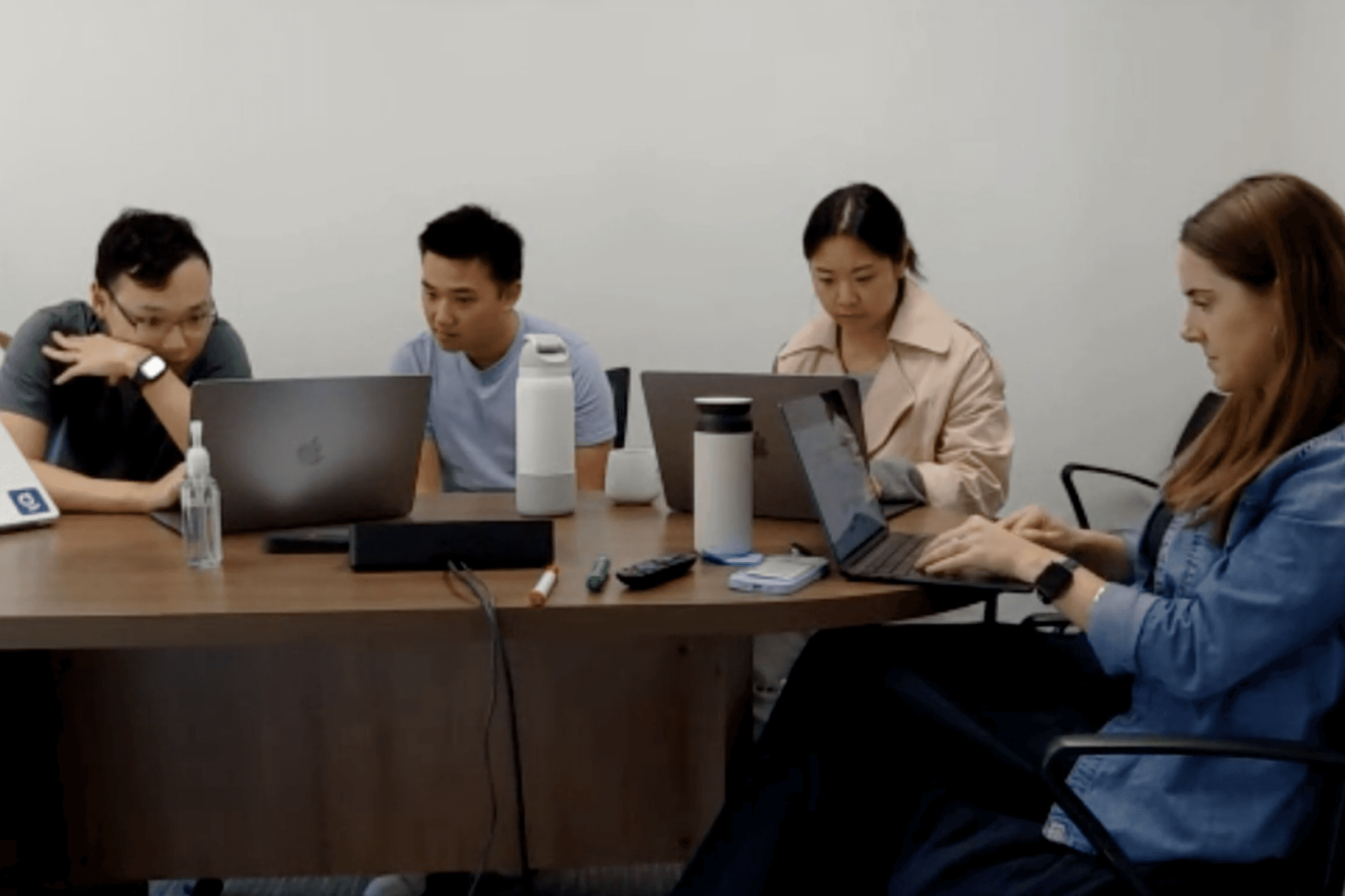
photos from user research sessions
Iterations
Improvements from research!
Talking with users reminded me that when you work on a product everyday and understand all of its nuances, you forget that the average user doesn't have any of that context or knowledge. Here are some of the improvements we made based findings from the user research.
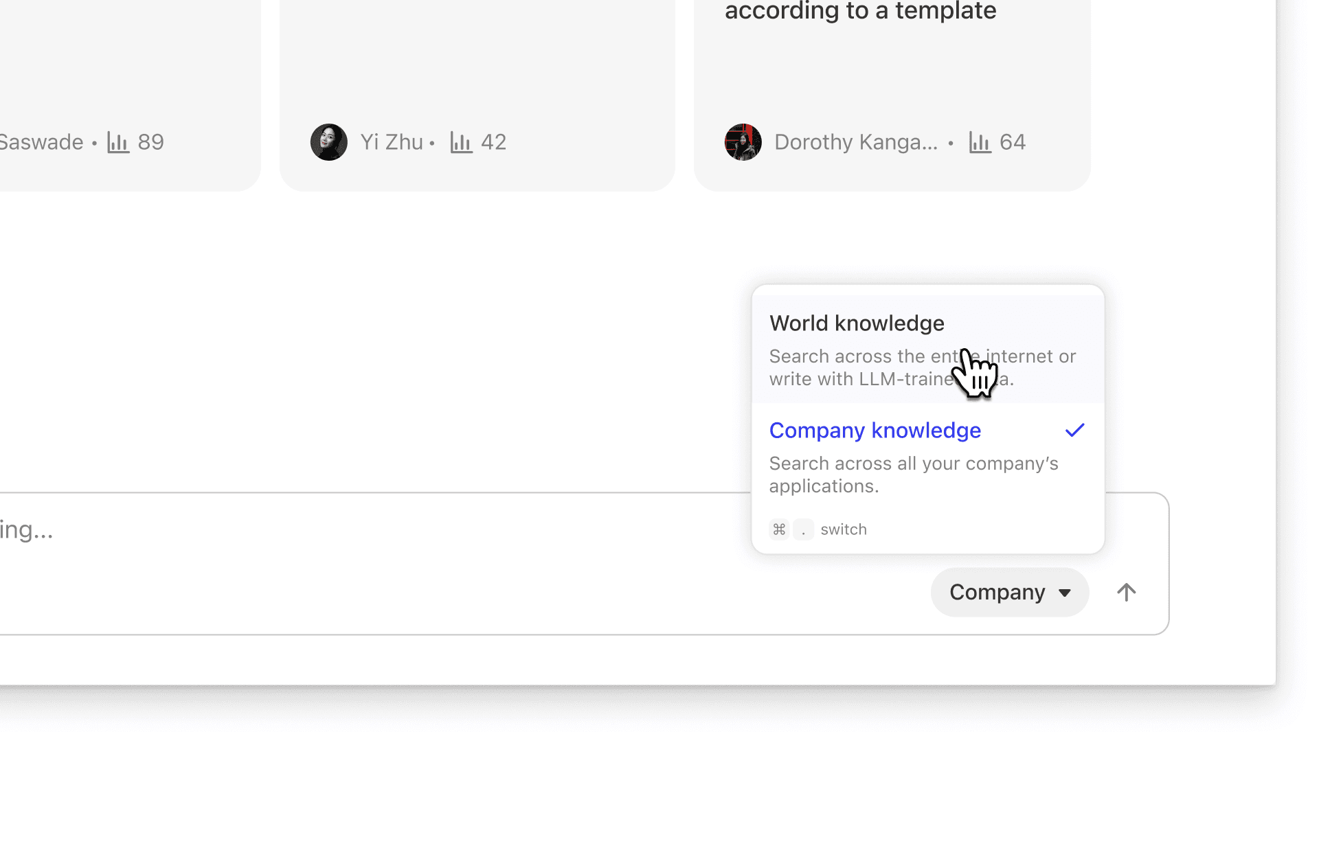
Participants understood the differences between the names "World Knowledge" and "Company Knowledge", but the icons didn't bring any additional clarity, so we removed them. This change also made it easier for the Web Search, which we could now use the globe icon for that instead.
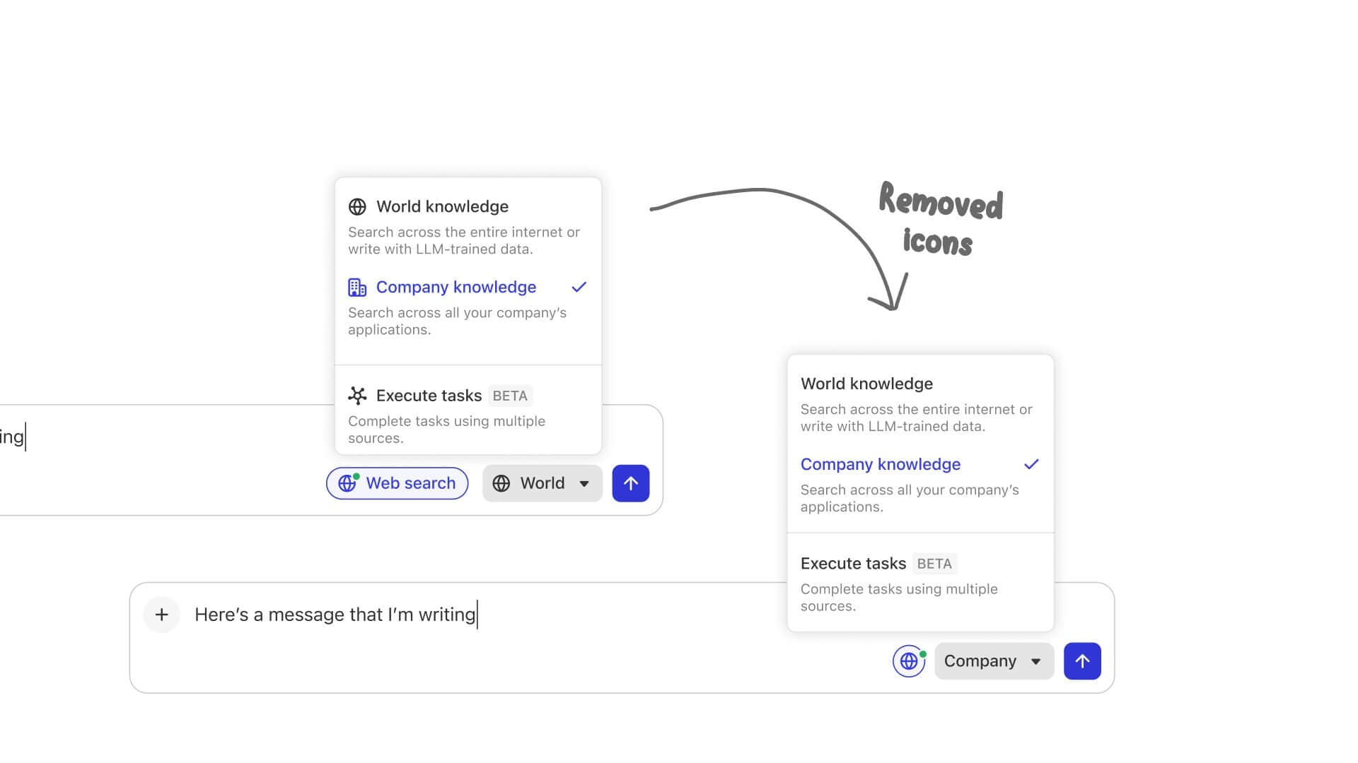
data source filters in glean assistant composer
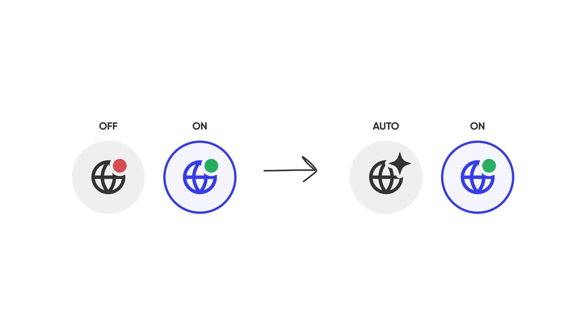
The average Glean user doesn't understand what an LLM is. There was a lot of confusion when we presented the web search button. "Why would I ever need to turn off web search? If Glean isn't getting information from the internet, then where is the information coming from?" This led us to change the behavior of the web search button to be automatic based on user query, and the user could force a web search. This AUTO/ON behavior would reduce the confusion for the average user, since they could just ignore the button and we would do the work of improving their query. Additionally, this would make our behavior consistent with ChatGPT Search, allowing them to pave the way for teaching users this behavior.
data source filters in glean assistant composer
We had a tooltip explaining the current mode the user was in, but learned that this was not clear at all. So with the new AUTO/ON behavior, we removed the tooltip when web search is ON, and when it's on AUTO, the tooltip would say "Turn on web search for every message".
data source filters in glean assistant composer
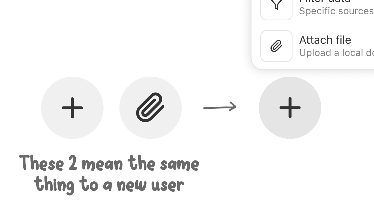
Leadership and product team kept pushing to bring important features, like file upload, out of the [+] menu. They argued that it should be more discoverable and not two clicks away. But I pushed back on this. The main reason is because when you start showing favorites for certain features, it won't scale in the future if someone launches a 'more important' feature. Additionally, one of the great things about user research was how we got to hear feedback from users directly. It was very clear that if they knew file upload was behind the [+] button. But if we introduce both a plus and a paperclip button next to each other, it would only lead to confusion.
data source filters in glean assistant composer
The Last Touches
Engineering Constraints
After these iterations, I put together all the final visual design polish and worked with Tommy Vo to build this out. We spent quite a bit of time perfecting the small details, like adapting the colors for dark mode colors, nailing all the button hover states, the focus and unfocused composer states, and figuring out all the edge cases for errors.
But like all products, there were many engineering constraints. One of the biggest issues was that the automatic web search detection was over-triggering. It was performing web searches on queries that shouldn't require web search. This led us to go back and change the behavior of the web search button to be from AUTO/ON to just be OFF/ON.
Finally, I explored several visual design variations for the button, including an ON/OFF button, a toggle switch, and versions with and without labels.
explorations for web search button
The Latest Designs
Introducing the new chat composer...
Glean Assistant and public knowledge
And with that, the (re)design of the Glean composer comes to an end. We launched this to 4 beta customers on December 17th 2024, and GA'd it on Jan 21st, 2025.
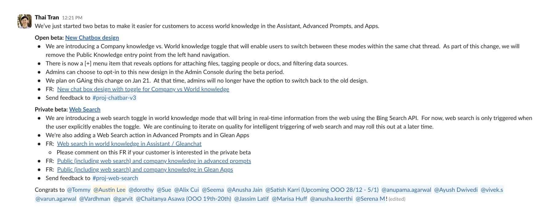
composer redesign internal launch announcement
Lessons Learned
Growth-Stage Startups Move So Fast.
I was constantly amazed at how quickly things got done, from engineers prototyping whole new experiences in just a week to designers sharing explorations and asking for final design reviews the day after. Not to mention, each designer owns an entirely different product. The pace of everything was so impressive and inspiring. During my time at Glean, I learned so much, and here are some of my biggest takeaways.
1. Prototyping improves craft.First, I realized how important prototyping is. Although static mocks are much easier to design, there's a lot you can't get from them. With prototyping, it's not only easier to communicate your ideas, but it also lets you FEEL the interactions. Especially when you can do this in code, you can really feel the craft of a design with all the hover states, cursor effects, and animation easing.
2. Take initiative to get things done.Second, I learned you have to really push and advocate to get things you want done, or it'll be quickly forgotten. This could just be a small visual polish or a larger design, like file drag and drop which was unfortunately never implemented. I learned how busy everyone is with so much work to do, so you have to push for it or nobody else will.
3. Great designers are more than just design.Finally, my biggest takeaway is that being a great designer isn't just about making explorations, but being able to form opinions about your designs to communicate and convince other people why a certain approach is the best. I learned that just sharing design options isn't very effective unless you really think about the pros and cons for each and propose a direction you're leaning and why.
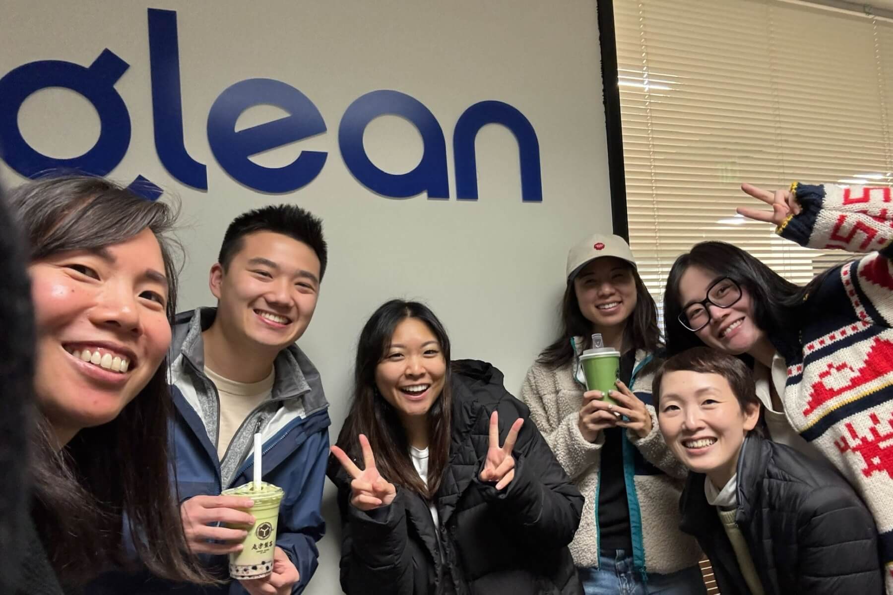
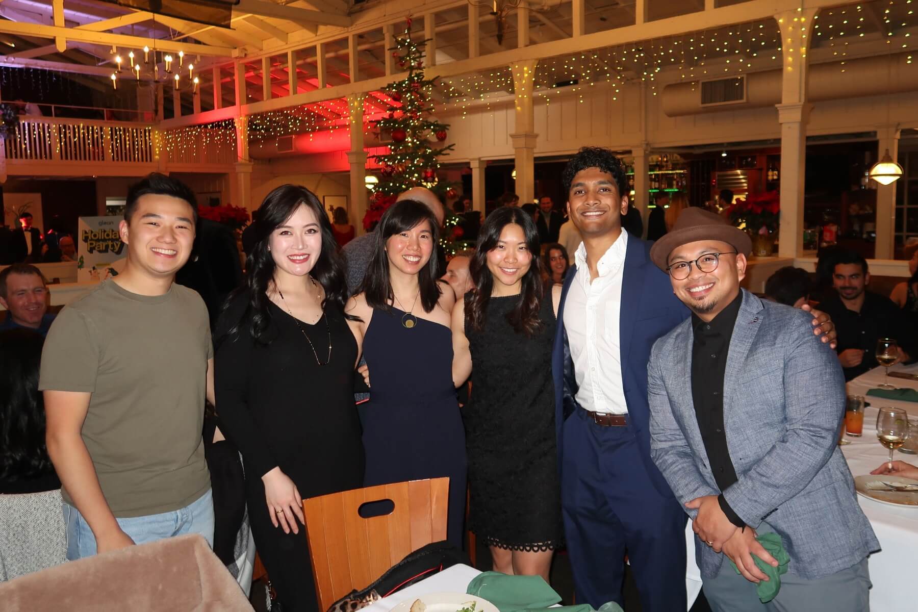
Photos with the glean design team